28. September 2021 By Viktoria Düngfelder
The dark side of UX - design patterns that manipulate users
In a fast-paced world, the time we have is precious to us. This is how the battle for our attention begins – especially online. But the difference is that there are companies that invest the time to build trust and loyalty and there are companies that get users to accidentally click and take out a monthly subscription, for example.
When we use websites and apps, we do not read every word on every page – we usually just skim through them and draw our own conclusions. Companies can exploit this by presenting content in such a way that it looks like it represents something other than what it actually does.
What are dark patterns?
Design patterns are design solutions that are established and work well. This is why they are reused and we get used to them. In contrast, anti-patterns are failed designs that have been proven not to be well received. However, there is no evil intention behind them.
The term dark pattern was coined by Harry Brignull in 2010.
Dark patterns are deliberate design decisions that attempt to intentionally mislead, deceive or manipulate the user on the basis of human psychology. They are designed to guide the actions of the user and the interests of the particular company are put above those of the user. The ironic thing is that dark patterns contradict the very meaning of user experience design. After all, a user’s experience with a product or service should be fast, easy and exciting. However, this dark side of UX can lead to reduced efficiency in the use of involuntary disclosure of information, data protection violations or even financial damage.
5 dark pattern strategies with examples
Nagging
The expected function is redirected beyond one or more interactions.
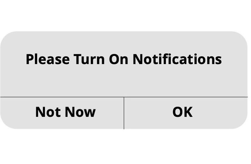
One example of nagging involves pushing the user to activate notifications. The only options that are available are ‘Not Now’ or ‘OK’. No option is provided for the case where a user does not want to turn on notifications. As a result, the app will keep asking.

Obstruction
A process is made more difficult than it needs to be with the intention of distracting from or preventing certain actions.

Brignull calls this type of dark pattern the roach motel. The principle is that it is easy to manoeuvre yourself into a situation but it is very difficult to get out again.
After the user has selected ‘annual’ from a previous drop-down menu, the drop-down menu disappears and the user’s choice is fixed. This can no longer be changed unless the user clicks back.
Sneaking
This is an attempt to hide, disguise or delay information that is relevant to the user.

Forced continuity is a typical case. A service is free for one month, after that there is a charge. It is particularly ‘dark’ if not only the call-to-action button has to be clicked, but the entire banner is clickable.
Interface interference
The user interface is manipulated in such a way that certain actions are to be considered preferable to others.

Cookie consent tricking belongs to the types aesthetic manipulation and false hierarchy.
Creative manipulation is used to generate a hierarchy that makes the rejection of tracking less likely when obtaining user consent. The ‘On’ and ‘Off’ buttons do not differ visually at all, which is particularly deceptive.

Forced action
The user is forced to perform a certain action in order to be able to use a particular function.
Privacy Zuckering – named after Facebook CEO Mark Zuckerberg – is a dark pattern that makes someone share more information about themselves than they intended.
In this example, the user can delete the app, but only the data on the device is deleted. If the user simply skims through the text, they may not be aware that their data continues to be stored.
You can find many more types of dark patterns with examples here
How much manipulation is still acceptable? – Recommendation of ethical guidelines
Where are the ethical boundaries? Of course, we, as users, bear part of the responsibly. We need to pay attention in order to make the right decisions. However, the design bears a significant part of the responsibility as well.
The question here is, as a UX designer, can I defend myself against my client’s accusation that I’ve knowingly created manipulative designs? Should there be something like a design codex? Unfortunately, there is still little that is legally binding in this area. Most dark patterns are just about legal.
Guidelines that include recommendations on avoiding conflicts of interest, acting in the best interest of all and acting with integrity, among other things, already exist, for example, in the UXPA Code of Professional Conduct and A Designer’s Code of Ethics Anyone who is a member of UXPA undertakes to respect these rules.
These guidelines will never be complete. This is why it is important to always reflect on whether a design decision is appropriate.
A short digression about design basics can be found in my blog post ‘User interface design – design basics for non-designers’.
Conclusion
The best defence against dark patterns is to be aware of them and reject companies that use them. More information is provided on Twitter (@darkpatterns) for those who are interested in greater awareness of this topic, more examples, or who want to know which companies like to dig deep into their bag of tricks.
Design patterns shape the way we are used to interacting online. It should go without saying that this language is understandable. This underlines the power that UX design can have. It is up to us to use it properly.
Would you like to learn more about exciting topics from the world of adesso? Then check out our latest blog posts.

